Admiralty Towers One
- Services
- Strategic Rebranding, Visual Identity & Creative Direction, Bespoke Website Design, Digital Operations & Automation, Leasing & Enquiry Journeys, Technical SEO
- Sector
- Residential Property
- Location
- Brisbane, Australia
The Challenge
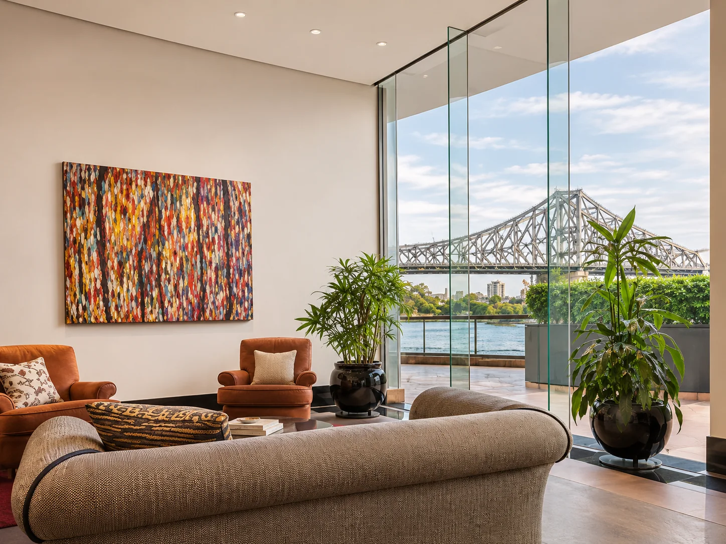
Admiralty Towers One is an established Brisbane riverfront address with strong architectural and lifestyle recognition. Its previous digital presentation needed a more distinctive brand expression, clearer resident and prospective-owner journeys, and a modern technical foundation capable of accommodating property communications, enquiries and evolving building operations.
Our Approach
Studio Orris developed a strategic rebrand spanning creative direction, visual identity, typography, content architecture and a new responsive web experience. Designed around the property's built heritage and riverfront location, the site structures information for residents, prospective buyers or tenants and building representatives. Bespoke front-end development, technical SEO, purposeful enquiry-to-transaction touchpoints and integration-ready administration workflows support a more usable platform. Automation and AI-assisted operational possibilities are approached as tools to support staff, with appropriate review and control.
Outcomes
A more recognisable visual identity and a contemporary digital experience aligned with the significance of the address. Clearer property information, enquiry pathways and a flexible architecture establish a stronger foundation for future administration and integrations. No unsupported SEO rankings, conversion rates or transaction results are claimed.
The Story
A familiar landmark. A completely reimagined identity.
Read moreShow less about the story
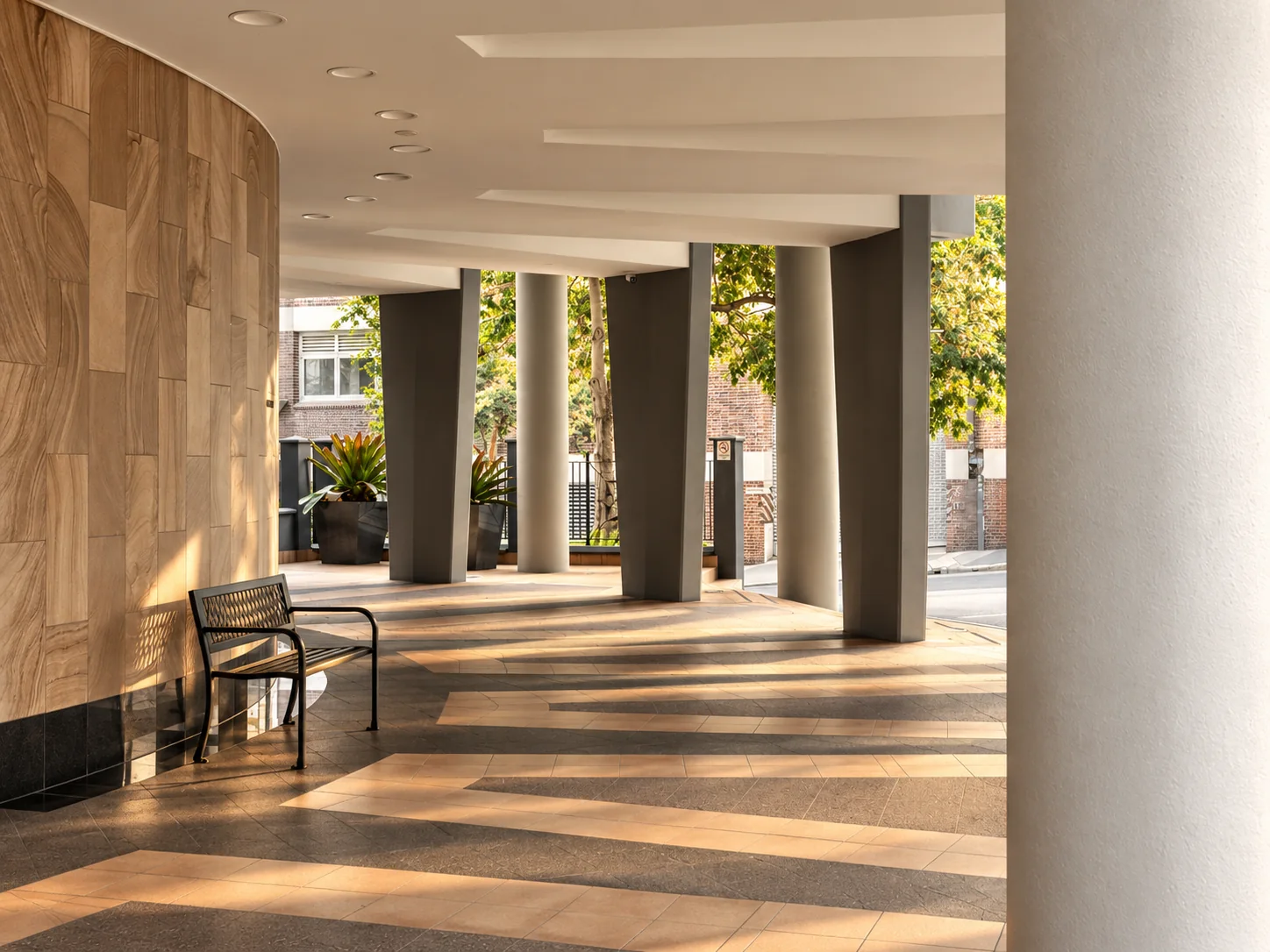
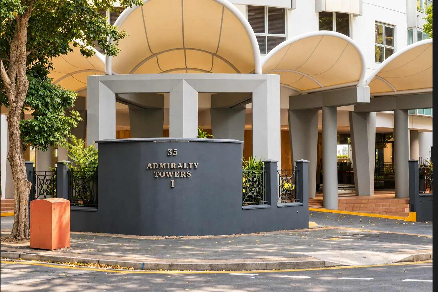
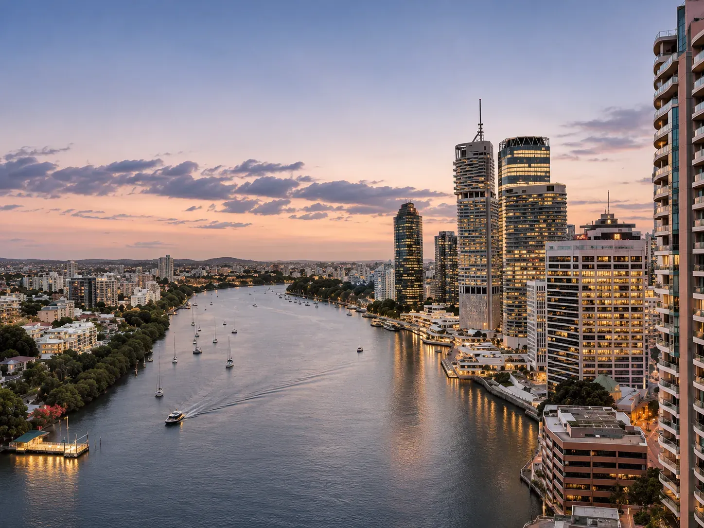
At 35 Howard Street, Admiralty Towers One is part of Brisbane's established riverfront residential landscape. Its rebrand required a careful balance: modernise how the property is presented without losing the architectural character and sense of permanence that define the address.
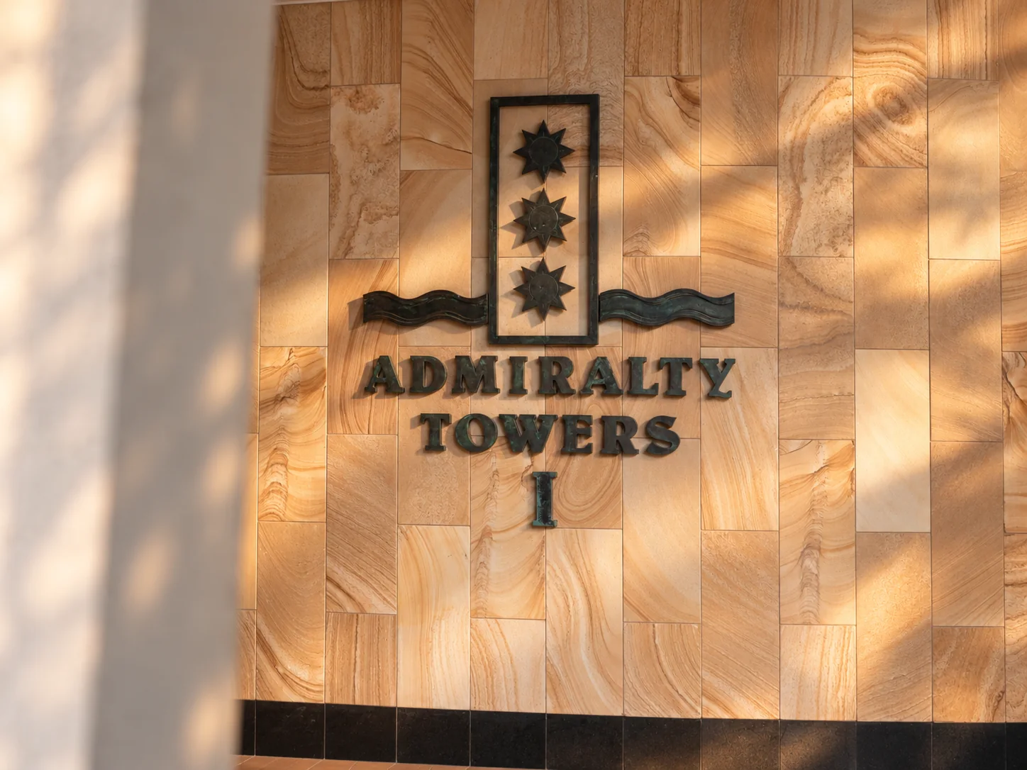
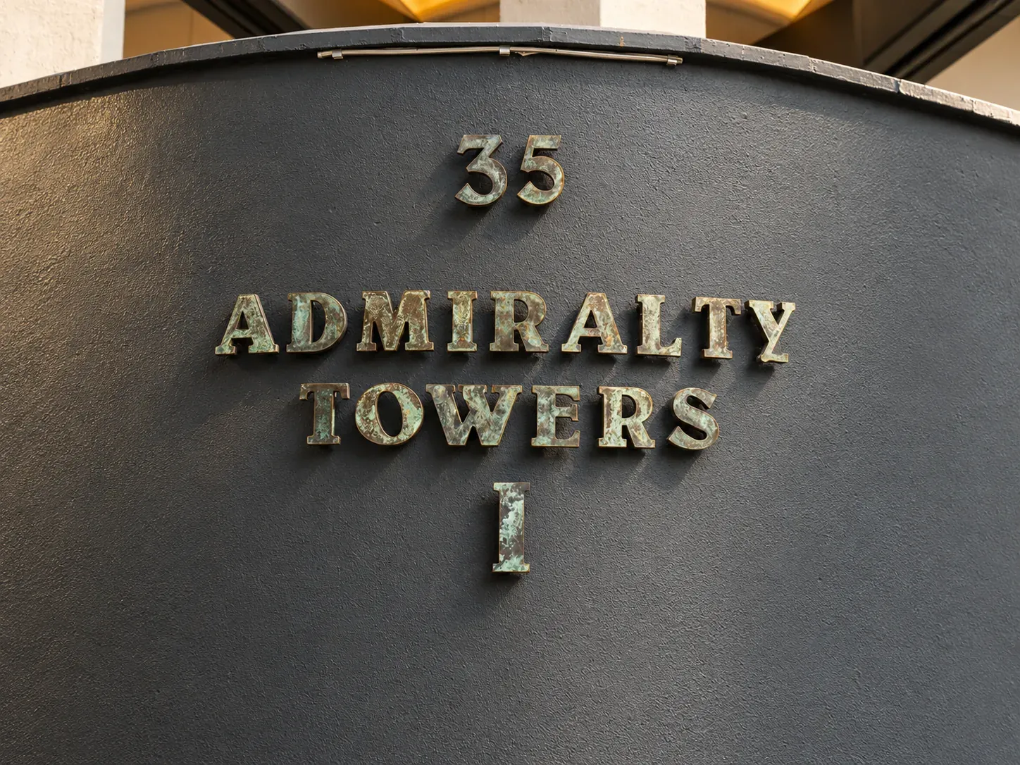
Studio Orris created a refined visual identity and bespoke digital direction, using purposeful typography, restrained colour, property photography and disciplined editorial layouts. The work extends from brand positioning into responsive UX/UI design, content systems and technical website development.
The site is shaped around everyday transactions and decisions: discovering the property, reviewing residential information, making leasing or sales enquiries, and locating relevant management contacts. Clear interaction pathways and search-friendly information architecture bring commercial usability into a premium visual environment.
We also considered how future-ready operational workflows and AI-assisted administration can support communication, content updates, triage and record handling, subject to appropriate human oversight. The objective is a tailored digital foundation rather than a generic property website template.
The outcome is a distinct rebrand supported by practical, scalable digital infrastructure—an updated expression of an established riverfront address.
Brand identity & applications