The Beige Code: Why Every Luxury Property Brand Looks the Same
Studio Orris · · 3 min read
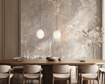
Cover the logo on the last five luxury apartment campaigns you saw. Could you still tell them apart? For a growing share of the property market, the honest answer is no. A shared visual language has settled over premium residential marketing: a refined serif wordmark, a palette of beige and stone, linen curtains catching morning light, a drone shot at golden hour, and a name that ends in "Residences". It works, which is precisely the problem.
The code in numbers
- 5.9 vs 5.1 : luxury ratings for brand names set in serif versus sans-serif type in a small 2024 study (27 participants)
- 2025 : the year Pantone made a brown, Mocha Mousse, its Colour of the Year
- 33% : average global price premium for branded residences, according to Savills
- ~910 : branded residence schemes worldwide by the end of 2025, up 19% in a year (Savills)
- 2023 : the year Burberry reintroduced its Equestrian Knight after five years of a minimalist wordmark
Sources are listed at the end of this article.
### A shared language of quiet luxury
The beige code did not appear by accident. It grew out of a broader cultural shift toward "quiet luxury", in which wealth is signalled through restraint rather than display. Fashion led the way, design media named the trend "beigeification", and property marketing followed with enthusiasm. Neutral palettes photograph well, age slowly and offend no one, which makes them an understandable choice for developments that must appeal to a broad pool of buyers and sell off the plan years before completion.
Typography reinforced the effect. As fashion houses flattened their logos into near-identical sans-serif wordmarks in the late 2010s, premium property moved the other way, toward elegant serifs that signal heritage and permanence. Combine the two and a recognisable formula emerges, one that now spans brochures, hoardings, display suites and Instagram feeds.
### To be fair, it works
The code persists because it does what it promises. In a small 2024 study presented at the Marketing Trends Congress, fictitious brand names set in serif type were rated higher on both elitism and opulence than the same names set without serifs, with an overall luxury score of 5.9 against 5.1. The sample was small, 27 young consumers, and the authors describe the work as ongoing, but the direction is consistent with what designers have long observed: serifs read as considered, established and expensive.
Colour tells a similar story. When Pantone named Mocha Mousse its Colour of the Year for 2025, it framed the warm brown as aspirational and quietly luxurious. NYU Stern's Thomaï Serdari offered a more pointed reading to CNBC: if the colour could express feelings, they would be cautiousness, safety and a permanent state of suspense.
Cautious. Safe. Suspended. That is an uncomfortably accurate description of how much premium property marketing now feels.
### Here is the catch: brand pays, but only if it is remembered
Brand matters enormously in residential property. Savills' latest research puts the average global price premium for branded residences at 33%, rising to 39% in resort locations, with the number of schemes worldwide growing by 19% in a single year. Buyers will pay more for a name they recognise and trust.
But a premium depends on recognition. If buyers cannot recall whose development they fell in love with, the visual investment strengthens the category rather than the brand. Every beige brochure makes the next beige brochure look more expected, and therefore less distinctive.
Marketing science has been warning about this for years. Jenni Romaniuk, research professor at the Ehrenberg-Bass Institute and author of Building Distinctive Brand Assets , argues that colours, logos and other brand assets exist to help people recognise a brand quickly, and that their core form should be kept stable rather than treated as trends. As she put it to Contagious, you don't want your distinctive assets to be fashion items.
Beige, right now, is a fashion item.
### Even the fashion houses are turning back
The clearest signal that sameness has limits comes from fashion itself. In 2018 Burberry replaced its long-standing identity with a stripped-back sans-serif wordmark, one of a wave of luxury rebrands that critics dubbed "blanding". In 2023, under a new creative director, Burberry reintroduced its Equestrian Knight and a more characterful wordmark. Commentators read the move as part of a wider return to distinctiveness, alongside a younger generation's appetite for colour, maximalism and personality.
Property brands do not need to abandon elegance to learn from this. They need to recognise that elegance alone is no longer a differentiator when everyone has adopted it.
### The cost of blending in
The risks of the beige code are rarely visible in a single campaign, because each campaign, judged on its own, looks polished and appropriate. The cost appears across the market.
- Recall erodes. When campaigns share a palette, typeface and photographic style, buyers remember the category rather than the developer.
- Pricing power weakens. If brands are interchangeable, buyers compare on price, location and specification alone, which is exactly what a brand premium is meant to rise above.
- Trust is harder to build. Distinctive, consistent assets accumulate familiarity over years. Generic ones reset with every project.
- Agencies become the brand. When the look comes from a shared design vocabulary rather than the developer's identity, the work signals the trend, not the company.
### What genuine distinctiveness looks like
Breaking the code does not mean abandoning restraint or chasing novelty. It means owning something specific and using it consistently.
- Choose one ownable asset and commit to it. A distinctive colour, a recurring architectural motif, a photographic style or a typographic voice, held stable across every project.
- Let the place speak. Brisbane's light, landscape and architecture are distinctive in themselves. A campaign that could be anywhere is a campaign that belongs nowhere.
- Use the logo test. Remove the name from your next campaign. If it could belong to three competitors, the brand is not doing its work.
- Separate elegance from sameness. Serifs, neutrals and calm photography can all be part of a distinctive identity, provided they are combined in a way only you use.
### The Studio Orris perspective
We should declare an interest: Studio Orris uses a serif too. Our identity is built on restraint, and we believe calm, considered design still has a place in premium markets. But restraint is a tone, not a strategy. The brands that hold their value through cycles are the ones buyers can recognise in a second, without reading the name. In a market where every developer speaks the same quiet language, the advantage goes to the one with something of its own to say.
So we will hold ourselves to the same test we propose to every client: if your logo vanished tomorrow, would anyone still know it was you?
For related reading, see our companion analysis: Brisbane's Property Boom Is Losing Momentum. But Have Buyers Really Lost Confidence?
### Sources and research
Research note: the serif study used a small sample and should be read as indicative rather than conclusive. "Almost every property brand" reflects Studio Orris's editorial observation of the market, not a measured statistic.
© 2026 Studio Orris. Original editorial analysis. This publication provides general commentary and does not constitute financial, investment or property advice.